Sign Language Creating Uniform Signage for Citizens and Visitors
|
|
Within community circles, a lot has been made of the poor state of existing signage. Most criticism is well deserved. People and organizations are trying to make areas well defined through signs, but past efforts lacked cohesion necessary to create a true sign system. Each type of signage (Welcome, directional “way finding”, informational, arrival and spot-direction) need to be part of a well defined system that is consistent in color palate, materials, graphics and integrated shapes. These integrated systems automatically inform the public that each sign provides valuable information instead of getting lost in the visual overload jungle that permeates most cities. Without a well defined system, each type of sign is part of a singular effort which often produces expensive one-off designs that will never effectively integrate into the overall sign plan and prevents visual cohesion.
In this e-news, we will look at an actual sign system designed for a real city, discuss the elements that make the signs successful and give examples of how that sign system could be implemented in a community like Emporia. The purpose of this educational process is to inform the public about good sign design and placement, so they can be effective in public advocacy and implementation. The following points will cover basic topics within the framework of signage.
Other factors in effective sign deployment include recognizing the speed of travelers within sign areas, matching signs with their correct function for the area and integrating certain types of signs into their
Please recognize that directional signage is just part of the overall consumer equation. Businesses and organizations are responsible for creating signage that is attractive to consumers, provides clear information about what the business is/does and is in a format that meets consumer needs (highway oriented signs for highway businesses, pedestrian oriented signs for businesses along a sidewalk corridor). Directional signage can get people to an area, but after that, it is up to the business to “seal the deal” with attractive signs and store fronts with convenient hours and great service that encourages traffic, spending and repeat visitors.
Now that you have some additional information concerning community sign theory, we hope that you can be an active participant in the creation of a new sign strategy for Emporia. |
Home / Blog / Business Enhancement /
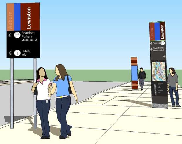 the use of color, graphics, shapes and font. Wording within the graphics piece needs to function well in a variety of formats, on various materials and in different color options. In Emporia, our current “logo” is based on a now defunct state logo (many other communities also based their community graphics on the same logo). The widespread use of our current graphic, when coupled with its non-unique nature makes our graphical identity inauthentic. Inclusion of subsets that utilize the same graphic with a different sub header makes community departments difficult to read and causes brand confusion. A solid graphics plan would give the city a color scheme, shape and graphical identity that could carry through signs.
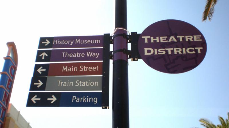 once. Communities have to prioritize and create density at a starting point and radiate out from that point. Communities must also make priorities in regards to directional signage inclusion. General geographic areas are typically part of downtown signage with more specific entities included in directional signage within the geographic area. The point is, you’ve got to pick the “big” geographically defined sectors, use signs to direct to those areas and then distribute to independent entities from that single sign point as you approach the area. For example- we wouldn’t expect directional signage to indicate a private entity like Emporia Main Street on city entry signs. It is up to Emporia Main Street to indicate our position within the larger geographic region of “downtown Emporia”.
 surroundings. If handled correctly, directional signage can improve traffic flow and create a more pleasant experience for travelers in the area while exposing important points of interest that drive consumer traffic and repeat business.